Single Image
Responsive image with aspect ratio control, captions, hover effects, and lazy loading — ready for commerce product shots, editorial headers, and content blocks.
Aspect Ratios
Fixed-ratio containers prevent layout shift during lazy load. Choose the ratio that matches your content slot.


Object-Fit Modes
Same container, different cropping strategy. object-cover fills and crops; object-contain letterboxes; object-fill stretches.

object-cover — crops to fill
object-contain — letterbox
object-fill — stretchesCaptions
Use figure + figcaption for accessible, SEO-friendly image descriptions.
Hover Effects
Applied via Tailwind's group + transition utilities. No custom CSS needed.
Radius & Shape
Prefer --radius-sm by default. Full-circle avatars are a common commerce use-case (brand logos, team shots).
Loading States
Skeleton prevents layout shift. Alpine.js swaps classes once the image fires @load.

Commerce Contexts
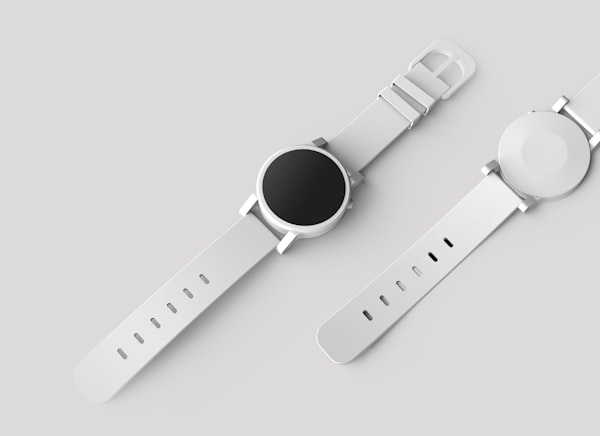
Common placements for single images in a commerce builder: product card thumbnail, category header banner, brand logo, and full-width hero.
Classic Timepiece
Product card — 1:1 thumbnail
Sizes
Width is always fluid within the container; these variants control height via fixed aspect ratios, not hardcoded pixel values.
lg — hero / editorial (full width, 21:9)